“복잡한 정보도 한눈에?” 3D 석조 계단 인포그래픽 만드는 3가지 비결
“복잡한 정보도 한눈에?” 3D 석조 계단 인포그래픽 만드는 3가지 비결
출처: 미상 · YouMind
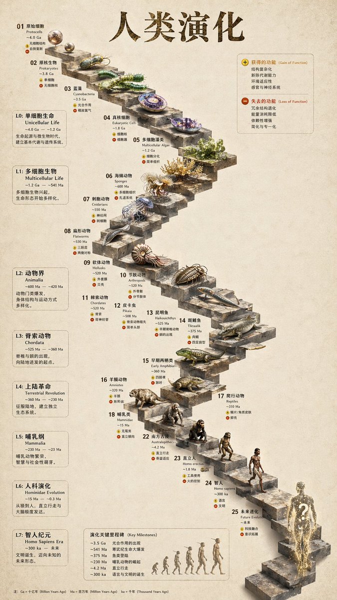
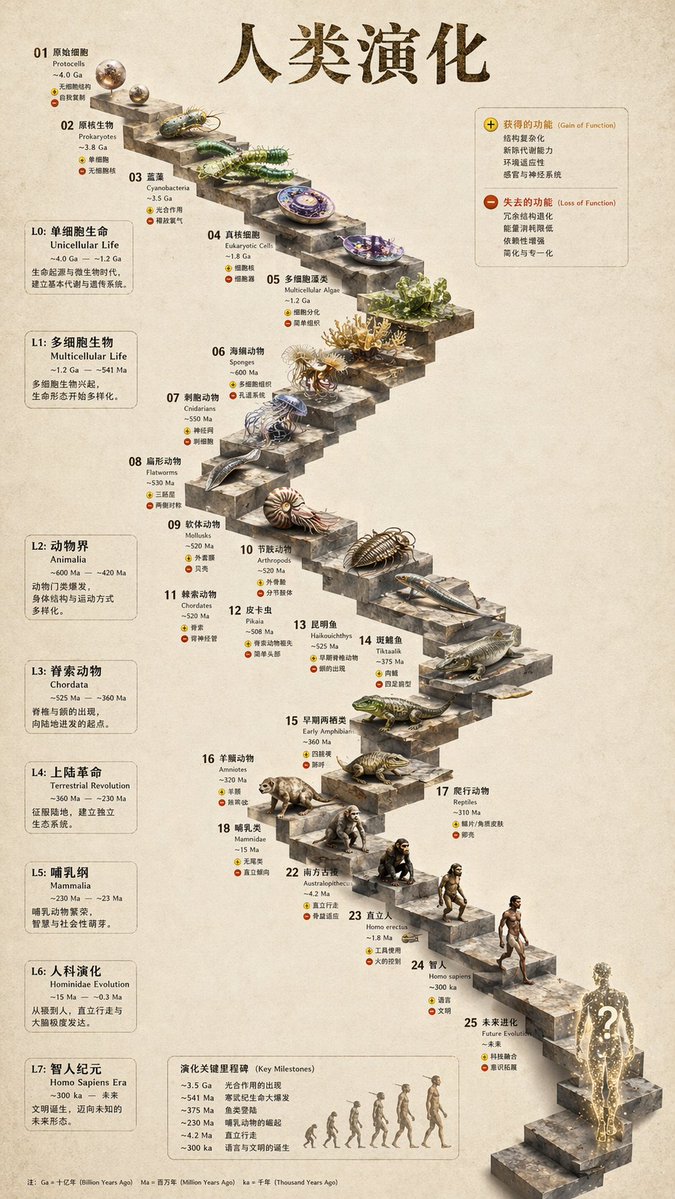
복잡한 데이터나 역사적 흐름을 단순히 텍스트로 나열하는 시대는 지났습니다. 최근 YouMind에서 소개된 3D 석조 계단 인포그래픽 스타일은 교육용 자료나 포트폴리오를 한층 전문적으로 보이게 만드는 강력한 시각화 도구입니다. 오늘은 GPT Image 2 모델을 활용해 누구나 고퀄리티 인포그래픽을 제작할 수 있는 노하우를 정리해 드립니다.
🎬 이런 스타일이란
이 스타일은 평면적인 타임라인을 입체적인 3D 구조물로 치환하는 것이 핵심입니다. 계단이라는 물리적 형태를 따라 시간의 흐름이나 진화 과정을 배치하고, 각 단계마다 상세한 디테일이 살아있는 렌더링을 결합합니다. 마치 박물관의 전시물이나 고급 학술지의 삽화를 보는 듯한 정교함과 구조적인 안정감이 특징입니다.
✍️ 프롬프트 접근법
성공적인 인포그래픽 생성을 위해서는 다음 4가지 요소를 프롬프트에 반드시 포함해야 합니다.
- 피사체 구조: ‘3D stone staircase’를 중심으로 각 계단이 시간의 흐름(evolutionary timeline)을 나타내도록 설정하세요.
- 시각적 디테일: 각 계단 위에 놓일 오브젝트의 질감(고대 석재, 현대적 금속 등)과 상세 묘사를 명시해야 합니다.
- 레이아웃: ‘Side panels’, ‘annotated labels’, ‘infographic layout’ 키워드를 사용하여 정보가 들어갈 공간을 확보하세요.
- 조명 및 분위기: ‘Studio lighting’, ‘soft shadows’, ‘cinematic depth of field’를 추가해 입체감을 극대화하세요.
[예시 1: 고대 건축 기술의 진화]
A highly detailed 3D infographic showing the evolution of architectural columns on a stone staircase. Each step represents a different historical era from Ancient Greek to Modern. Realistic stone textures, soft cinematic studio lighting, side panels with placeholder text, clean composition, 8k resolution, professional educational chart style.
A highly detailed 3D infographic showing the evolution of architectural columns on a stone staircase. Each step represents a different historical era from Ancient Greek to Modern. Realistic stone textures, soft cinematic studio lighting, side panels with placeholder text, clean composition, 8k resolution, professional educational chart style.
[예시 2: 생물학적 진화 과정]
A 3D isometric view of a winding stone staircase representing the evolutionary timeline of marine life. Each step features a hyper-realistic 3D model of a creature. Structured infographic layout with side annotations, neutral background, soft ambient lighting, high-end scientific illustration style.
A 3D isometric view of a winding stone staircase representing the evolutionary timeline of marine life. Each step features a hyper-realistic 3D model of a creature. Structured infographic layout with side annotations, neutral background, soft ambient lighting, high-end scientific illustration style.
💡 활용 팁
- 비율 조절: 인포그래픽은 가로로 긴 형태(16:9)가 정보를 배치하기에 훨씬 유리합니다. 모델 설정에서 화면 비율을 조정하세요.
- 텍스트 후작업: AI는 복잡한 텍스트를 완벽하게 생성하지 못할 때가 많습니다. 이미지는 ‘레이아웃’ 위주로 생성하고, 실제 상세 설명은 캔바(Canva)나 포토샵으로 텍스트를 입히는 것이 훨씬 깔끔합니다.
- 색감 통일: ‘Monochromatic with gold accents’와 같이 색상 팔레트를 지정하면 훨씬 정돈된 느낌의 인포그래픽이 완성됩니다.
#AI이미지 #인포그래픽 #GPTImage2 #디자인꿀팁 #3D렌더링 #데이터시각화 #프롬프트엔지니어링